
What Is The Best Acrylic Paint for Artists? (Updated for 2026)

Lately when I head to the art supply store, I am overwhelmed by all of the choices. There are literally thousands of different paints and they all have different descriptions. I figured if I am overwhelmed, you must be, too.
I'm on a mission to find the best choice when it comes to high pigment load, good quality and vibrant colors. So...what is the best acrylic paint? Let's find out!
Before we dive in, I just want to make it clear that I didn't receive any compensation for this article. I was generally curious about which paints had the most vibrant colours and consistency, so I tested and tested...
So...which brands make the best acrylics? I use paint a lot in my classes and with my own art and I am always wondering if I am purchasing the right brand or the right thickness of paint (also known as body).
Before we dive deep into top acrylic paint brands, let me explain a little bit of terminology as it relates to the different kinds of acrylic paint. Also, if you are looking for information on oil painting techniques or oil paints in general, this is not the right place. I will be focusing entirely on the right acrylic paint for your personal preference!
Acrylic Paint 101: Some of the Most Common Questions About Acrylic Paint

What is acrylic paint?
Affiliate disclaimer: While I stand by the products I recommend, I occasionally make a small commission from affiliate links
Acrylic paint is a water soluble type of paint that is made from acrylic polymers, pigment, and water. It's a popular choice because you can water it down, it has a fast drying time, and you can add lots of additives to the paint (gloss, metallics, pastes) to change the way it looks and feels on different surfaces.
Acrylic paint is not water resistant in the same way as oil-based paint. It actually mixes well with water and this is done to thin the paint out. This also eliminates the need to add harsh chemicals.

Is there a difference in the quality of acrylic paint?
In short, yes. There is a huge difference in the quality. Sometimes you can’t tell from an open bottle, but once the paint is dry, the difference is significant.
Why? It’s because of what’s been added to the paint and how pure the pigment is. The highest quality of acrylic paint will have the purest pigment.
I have also noticed that some acrylic paints have more elasticity and shine than others. This is due to the ratio of additives inside the paint.
Can acrylic paint be washed off?
When it comes to acrylic painting, you are sure to make a mess at some point. Art supplies are messy! So does acrylic paint come out? If you wash it immediately, it should come out of clothing like cotton or denim. However, acrylic paint is a permanent paint, so definitely dress for a mess when you use it. In my experience, acrylic paint does stain.
Silk and synthetic fabrics are trickier but the important thing is to clean it immediately. Acrylic paint is permanent which is why most elementary art teachers will never use it! If you are asking if it can be washed off of a canvas, probably not. However, you can paint over acrylic paint!
Color, Hue, Tint, Shade, Pigment: What does this all mean?

First, let me explain the main difference between a color and a hue.
Color – color is the umbrella term. It describes every tint, hue, shade, tone that you see.
Hue – Hue refers to the original or the main color. For example, red, yellow and blue are all hues – if you opened a tube of paint and it said cadmium red, the hue would be red. Primary, secondary and tertiary colors are all known as hues. Examples of hues are: red, orange, yellow, green, blue and purple.
Tint – Tint is what you get if you add white to any color. Pastels are the most common tints, but sometimes even just a subtle amount of white is considered a tint. All this means is that a tint is a paler version of a hue. Always start with the white and gradually add the hue when mixing colors.
Shade – On the other hand, you’ve got shades. Shades are just like tints except instead of adding white, you’ll be adding black. When mixing shades, you want to start with the color first, then add the black. It is nearly impossible to see any color in a shade if you start with the black when mixing.
Pigment – the natural color used to make paint. Typically pure pigments come in a powder. It is then mixed with an acrylic polymer and water to fuse together to make paint.
Ok, so now that we’ve got some of those items out of the way, let’s discuss acrylic paint: how to buy it, what to look for and…
How are paints categorized?
When you are purchasing paint, you can actually look to see which pigments are in the paint tube. For example, I did a full study of Cerulean blue. I bought it in several brands to see what the differences are.
The ones that said PB36 is a pure blue. That means that there is only one pigment in the bottle. Some of the bottles said Cerulean Blue, but actually had other pigments and sometimes white.
Professional-grade paints are typically the ones with the purest pigments. This is because professional artists prefer to mix their own colors using the highest quality professional paints and pigments rather than purchasing blended colors.


This bottle shows that the blue is made from a variety of pigments, so it is not pure cerulean.
If you’re curious about how paints are made, the Golden website has a ton of information about the chemical composition, permanency and level of gloss.
Are expensive paints better?
Great question. I always wondered if those insanely expensive paints yield better results. Are the best acrylic paint brands a good choice for all skill levels or is there a big difference between student grade acrylics and professional-grade acrylics?
I tried a whole bunch of brands to find out the answers. Keep reading!
What are the different grades of paint?
Each art supply store uses a different system of categorization. However, there are typically three grades: Student grade, artist grade and professional grade.
Student grade is self explanatory. Artist grade is for someone who loves to paint but isn’t quite ready to sell their work. Professional grade is for those who want to sell their work.
What is the difference between student quality VS artist-grade paint?

ARTIST GRADE PAINT:
These are considered professional quality paints. They have fewer additives, no extenders, smooth consistency, predictable drying process, and have a high ratio of pigment.
Artist grade paints are rated by series number and are a better choice for serious artists. They work well on a variety of surfaces and can be used with different materials and additives or mediums.
SERIES NUMBER:
A series 4 paint is more expensive than a series 2 paint but the quality is the same. So why is Cerulean blue more expensive than another color with the same amount of ounces and by the same brand? It is because the cerulean blue pigment is more expensive or challenging to manufacture.
Again, this doesn’t mean that it is better quality – it is just that all colors do not cost the same amount of money – crazy, right?? When I was in college, I minored in glass blowing and we had the same issue when sourcing glass – some colors were a lot more expensive than others. Again, this has nothing to do with quality.
STUDENT GRADE PAINT:
Student grade acrylic paints aren’t nearly as expensive as the artist grade. How do they do that?! They use less pigment and add lots of stuff to make the colors - these are called additives.
The best way to think about this is that it’s similar to food. There’s a difference between eating naturally wild caught salmon vs salmon with added color. Typically, student grade paints aren’t made with pigment, but with hues that have been blended to make a color as close to the original at a more affordable price. If you study color theory, you will understand that these aren't pure colors.
This is why you can pick up a bottle of blue acrylic paint at the dollar store. Notice that it doesn’t say “cerulean blue." It just says blue. It’s a blue that’s got hues and additives to make it work.
Does high quality really matter? I had the same question and unfortunately it really does…I will get into that a little more later…
The different types of acrylic paint

Dollar Tree Paint Brand

Dollar Tree Paint Brand
HEAVY BODY ACRYLICS:
This means that the paint has a high viscosity – it is a thicker paint, and more sticky. The color doesn’t change because it is made with the same pigment as your standard acrylic paint, but the glossiness might look different.
Heavy-body acrylics are great for artists who want their brush strokes to show and like having texture in their work. Heavy body acrylics are more expensive and so they are typically considered professional grade paints.
SOFT BODY ACRYLICS:
These have a lower viscosity which means that the paint is smooth when applied. They have the same amount of pigment as the heavy body, but with a much different consistency. The color should be the same, though, because it uses the same amount of pigment.
Soft paints don’t show texture as well, although you will still see some slight brush strokes when dry. They’re easy to blend but also easy to use for details like facial features.
ACRYLIC FLUIDS (INKS, & HIGH FLOW PAINTS)
These paints have the same ratio of pigment, but they are thinner and so you use more. They move on the canvas very easily and mix well with both heavy body and other acrylics. They can be used in an airbrush or fabric.
You can also use these like watercolor paint. Fluids are also great for dripping and splatter painting.
There are also things you can add to your paint to change the chemistry (glosses, gels, pastes) but we can get to that another time.
ACRYLIC PAINT PENS:
These are pens that are filled with acrylic paint. They dry out relatively quickly and come in a range of quality and variety, but if you’re looking for the control that you get from using a pen – these are the way to go!
They do leak often and they can be frustrating to work with. They work on glass, metal and other non-porous materials.
Side by Side Comparison of the Best Acrylic Paint Brands
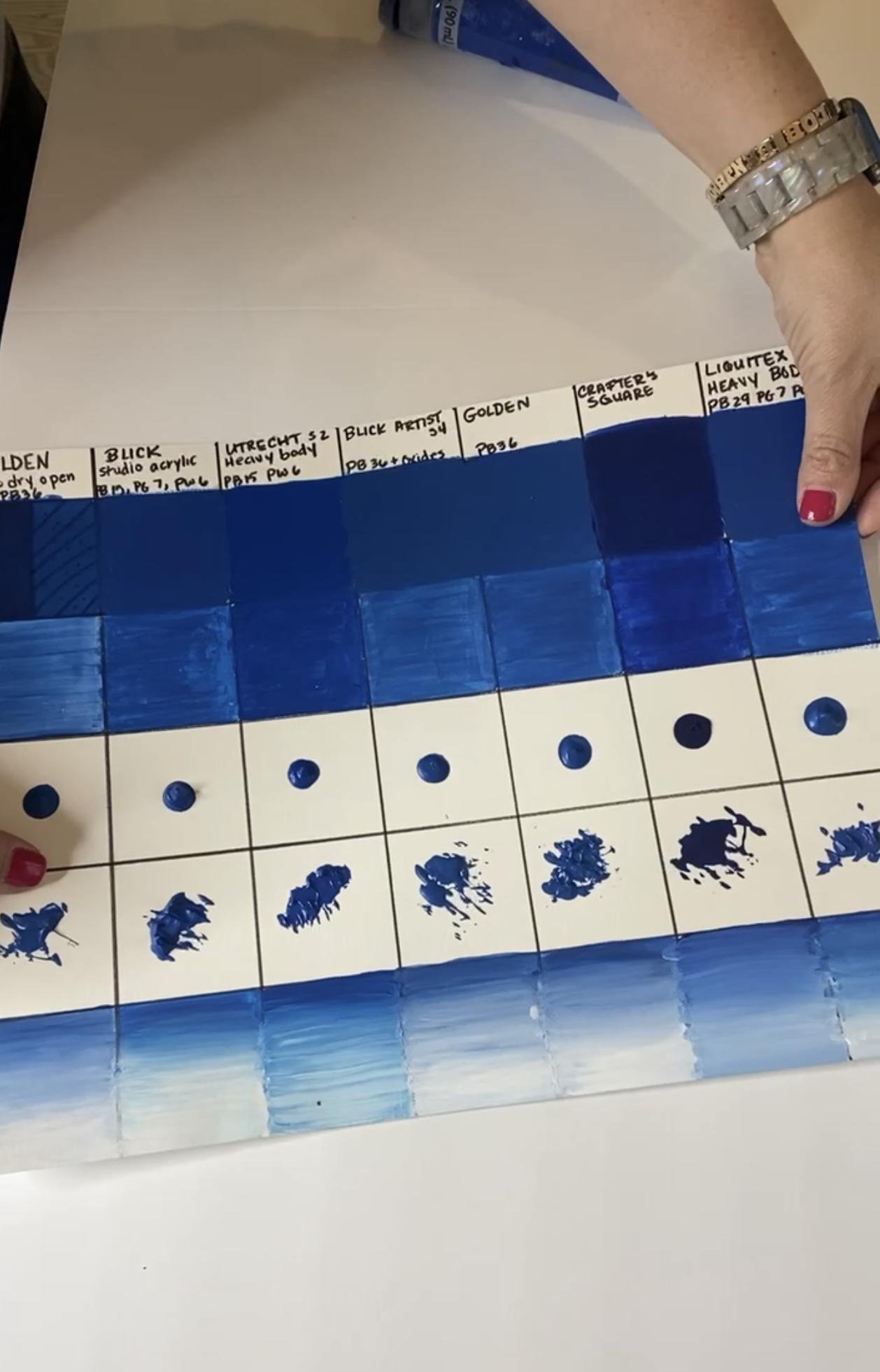
Ok, so now that I’ve got the technical stuff out of the way, let’s get into my deep dive. I’ve been painting with my classes for a long time, but I typically buy whatever is the least expensive (Folk Art, Craft Smart, Dollar Tree, etc). Since I am a self-proclaimed art supply junkie, I decided to do a deep dive to see if my instincts were right. Here’s how I did my (not so) scientific study.
I took a trip to Blick, Michaels and Hobby Lobby and purchased several bottles of Cerulean Blue. I focused on just purchasing items that said Cerulean. The only exception was the Craft Smart and the Dollar Tree brands because they make their own names for blue.
I tried to make my study as fair and scientific as possible. I made a chart with each paint title. Then I made columns for the different brands to see both how well the paint covered, how fast and smooth it dried, how it reacted when blended with white and how it retained texture.
I tested soft body paints, heavy body paints (like Golden heavy body acrylics) and I even tried acrylic ink. I was on a mission to find the best paint - both the best professional acrylic paint and the best student grade paint.
My findings were interesting. I recorded them both on paper and on this chart:
Column one is Golden, and for some reason I can’t seem to add it onto the chart at the time of publishing.


What acrylic paint should you buy?
It depends on what your goals are. Below are the best for beginners, professionals and everyone in between.
After testing and testing I definitely have an idea of the top acrylic paint brands. It is a good idea for you to do your own testing and research, but hopefully this will be used as a guide until you discover your top picks. In my experience, I sometimes discover new paints when testing.
Best Acrylic Paint Overall (value and quality): Golden and Liquitex

If you’re just starting out and you want high-quality paint, but don’t want to break the bank, then my absolute favorite brand overall for both students and artists is the Hobby Lobby brand, Master’s touch thick body acrylic paint. I also love liquitex basics and utrecht brand (Blick owned)
It is not the most expensive paint but it was a heavy body paint, creamy and consistent and with excellent coverage. It was a dream to paint with, and mixed well with others.
Utrecht is a quality paint and everything about the paint made me happy. Plus, I love the way it dries. It only took two coats to cover the black – which was way less than all of the other brands.
Best Acrylic Paint for Beginners or Students: Plaid or Apple Barrel

For elementary students, I highly recommend using either the Apple Barrel brands or the Plaid brands. Both are more than sufficient.
If you are working in a school and have a budget, the Blick student grade acrylics are great. If you are teaching high school students, I would recommend the Utrecht brands or the Hobby Lobby master’s touch acrylics. They have a great consistency and are very easy to work with.
Best Acrylic Paint for Kids:

If you’re working with kids, start with a craft paint like Apple Barrel, Plaid or Deco paint. I would not, however, recommend the Dollar Tree paint.
I found that it cracks and that the dry is chalky and might cause issues for kids with sensory issues. These all have a higher viscosity than the professional paint types.
Best Professional Acrylic Paint for Artists:

I would recommend the Golden paint. They have the best quality and coverage. They are a joy to paint with. They have a huge product line and they make variety packs! A very close second would be Liquitex! They have wonderful variety packs as well!
Best Acrylic Paint for Pouring:

I like Golden fluid acrylics for when I want more transparency. However, a little insider secret is to use house paint from the hardware or home improvement store and then add some Floetrol to the mix. This will cost less and give you the movement you’re looking for.
Add silicone treadmill lubricant if you want to add cells to the paint. If you want something ready made, I love the Liquitex fluid. They come in a variety of colors.
Best Value Acrylic Paint:

For a great value, I would recommend using the house brands at the art supply stores. Michaels, Blick, and Hobby Lobby all have their own professional brands which are great! I especially love the heavy body at Hobby Lobby. I do find that the blick paint dries faster than the other brands which is good if you want fast-drying paint. If you want a slower drying paint, try Golden OPEN acrylics.
The reason I love working with the store bought brands is because there is always either a sale or a coupon to offset the cost.
Best Acrylic Paint for Gelli Printing:
Before you click on the image below, just note that I like different paints for different purposes and the fluid works great for some image transfers, but I prefer using either Amsterdam acrylics or Liquitex Basics or Master’s touch heavy body acrylics.

The best acrylic paints for Gelli printing are Amsterdam, liquitex basics and Master’s touch acrylics. If you want more information on Gelli printing, check out this post.
I did test out Winsor & Newton and I love the way some of their paints work on my gel plate. I also noticed that some paints work better for simply printing colorful sheets and designs and others work better for image transfer. I wrote up all of my findings in this article.
I guess the right choice for you really depends on what your goals are. Are you learning to paint or refining your technique? Are you painting on canvas or doing a pour paint project?
So many factors go into choosing the right acrylic paint for your project, but you can't go wrong with the Utrecht paint by Blick!
FAQs About the Best Acrylic Paint Brands
Is Folk Art paint good? How about Apple Barrel?
Yes. Folk art paint is great for the average crafter. I use these brands all the time in my crafting classes. They are not professional-grade, but they work great. They dry with a bit of a chalkier, matte finish rather than gloss. But you can add a medium on top to add some shine.
How was the Dollar Tree Brand Paint?
Honestly, it was a pleasure to use while painting, but the way it dried was not great. It went from a Cerulean shade of blue to a dark navy in the dry stage. It also dried really chalky and didn’t have great coverage – I was disappointed. That being said when I mixed it with the Utrect white, it definitely helped the quality. But the texture is the real issue because it doesn’t hold any texture (totally flattened) and has no shine – it doesn’t feel great on the hands. Do I think the dollar tree paint is the best thing since sliced bread? No. But the fact that you can buy paint at that price is great for when you are low on cash or just starting out.
What paint should I use with kids?
For a beginner painter, I would start with the Craft Smart brands or the Folk Art brands. I also really like the Walmart Apple Barrel and the Hobby Lobby Anita brands - any of these would be a great choice for a kiddo's first acrylic paint! They dry a bit chalkier, but kids don’t seem to mind and then they can always add an additional layer of Mod Podge after. Easy peasy! I would also say, if you are able to add a little extra cost, I would recommend finding the best acrylic paint set for your budget.
What's the drying time of acrylic paint?
Whether you're a seasoned artist or a new painter, understanding the drying time of the paint you're using is an important part of the painting process. In addition to how the paint itself dries, there are a ton of external factors that can influence the drying process of acrylic paints. Things like environmental conditions, air circulation, the thickness of the paint layer, if you're painting on porous surfaces, and more can all contribute to acrylic paint drying time. High humidity, cooler temperatures, thick layers of paint, the painting surface itself, and other various factors can all make for long waits when you're working with acrylic paints. For best results, work in studio space with warmer temperatures and low humidity, use thin layers of paint, and give your wet paint enough time completely dry.
What about metallic paints?
I didn’t test paints with heavy metals this time around, but maybe next time!
What acrylic paints are best for Gelli printing?
Gelli printing is a totally different way of working with acrylic paint. My favorite paints for general use are quite different. To see my two favorite paint brands for working with a gelli plate, check it out here.
What acrylic paints do professionals use?
Professional painting artists often use Golden or Liquitex. However, some artists mix their own paint using pigments and additives and some purchase tube colors. The answer to this question also depends on the artist’s painting techniques. Some like higher permanence ratings and some prefer to use acrylic gouache which is very expensive. There are so many choices on the market today so each artist will make the perfect choice for what works with their goals.
Is Liquitex or Golden better?
It depends on what your goals are. They are both great paints. Personally, I loved working with the Golden for Gelli printing because it rolls on easily and prints beautifully. I like the Liquitex for canvas painting because it held its shape when dry. However, if texture isn’t your thing, the Golden is great for a smooth, high gloss finish.
Do you want to know about Liquitex Gel Medium? Check out this post!
Happy Painting!
I hope you found everything you need to pick the best acrylic paint for your projects. Don’t forget to check out my paintbrush care tips before you start!